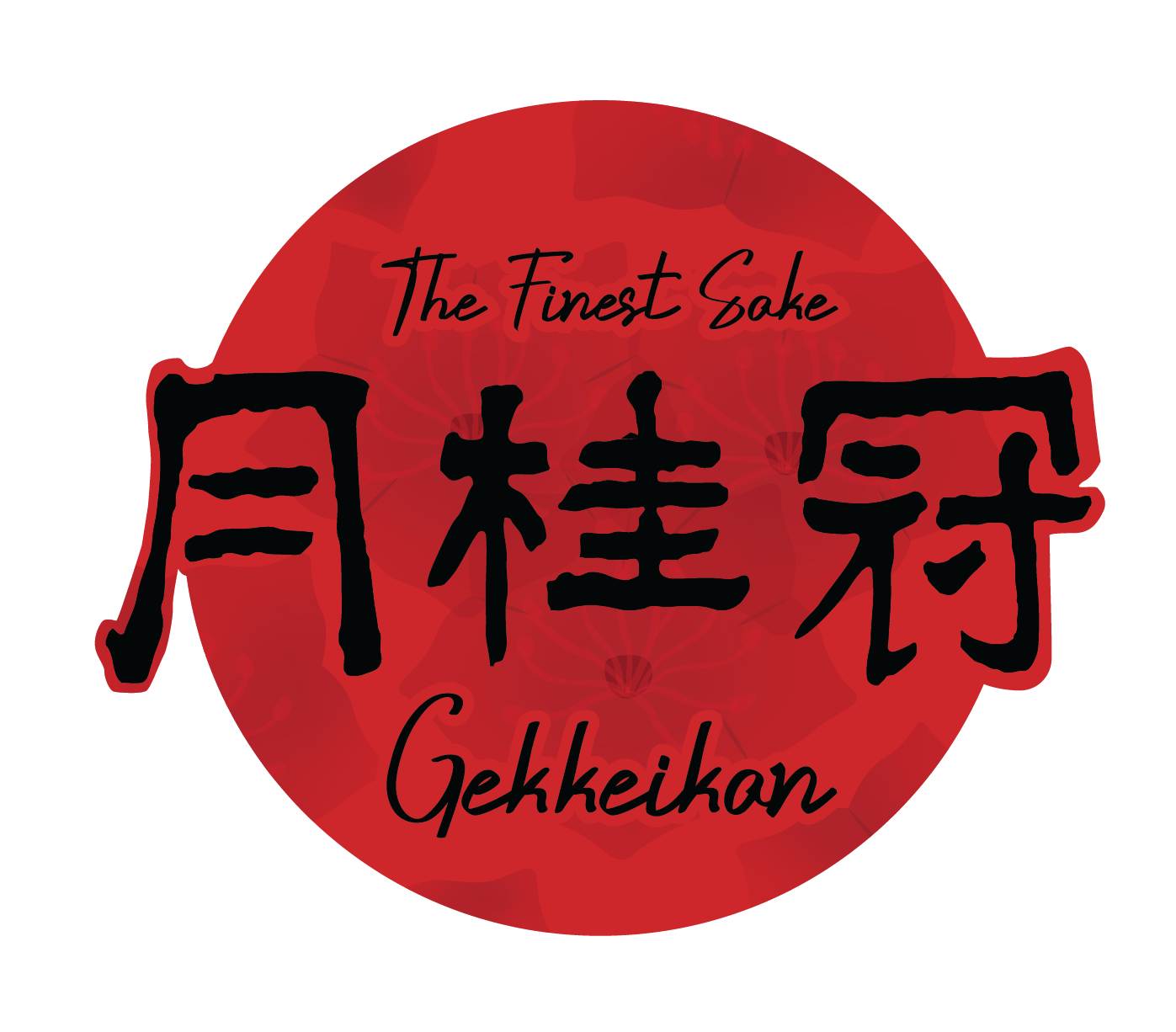
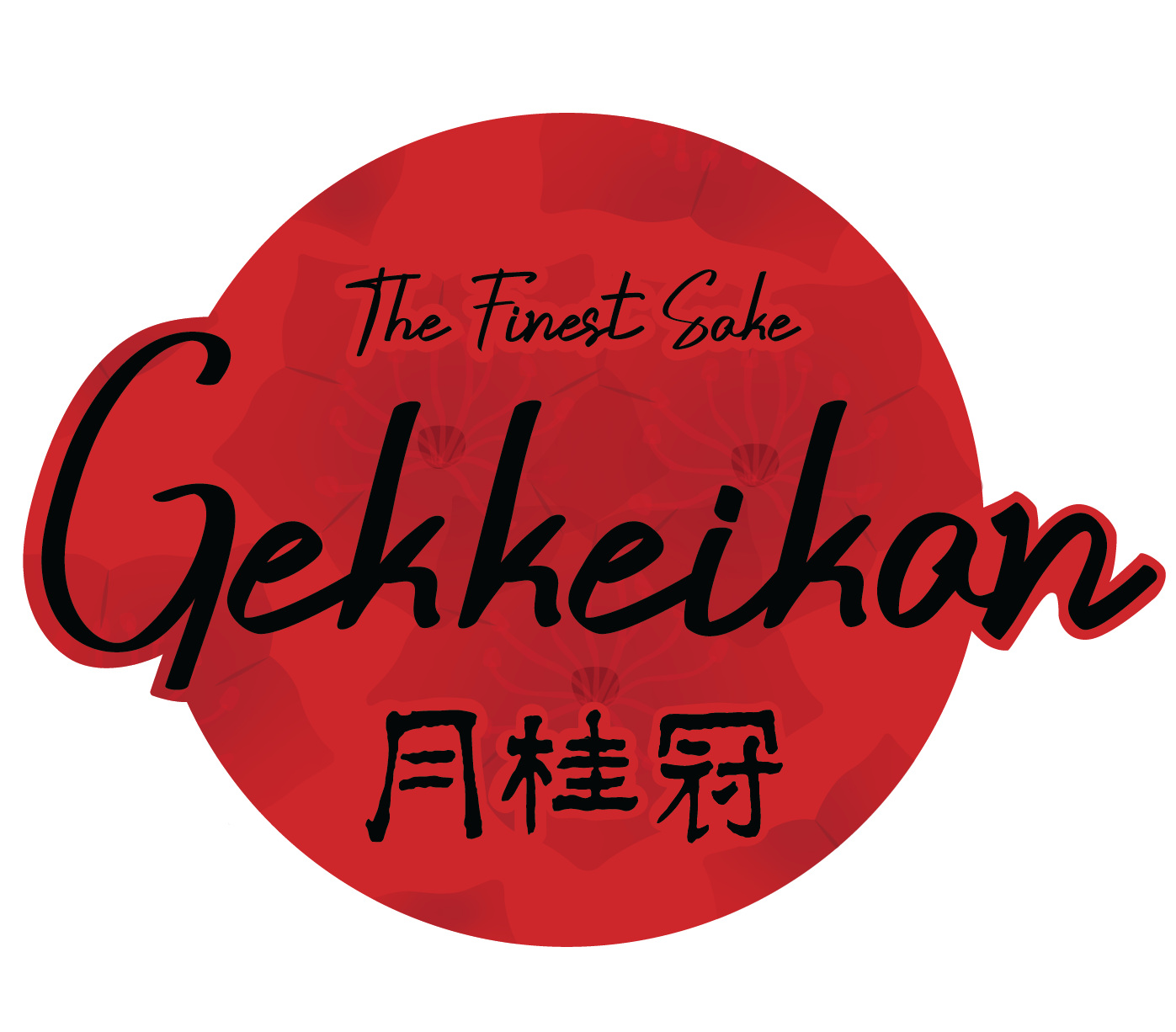

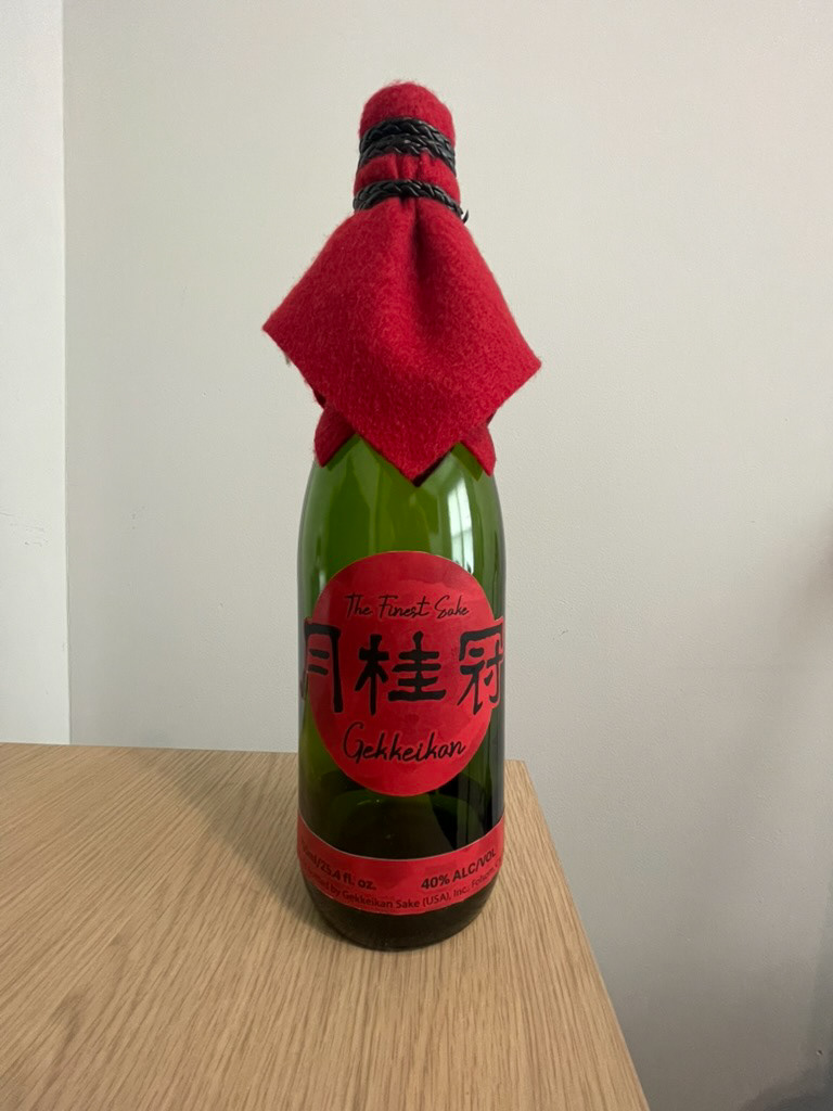
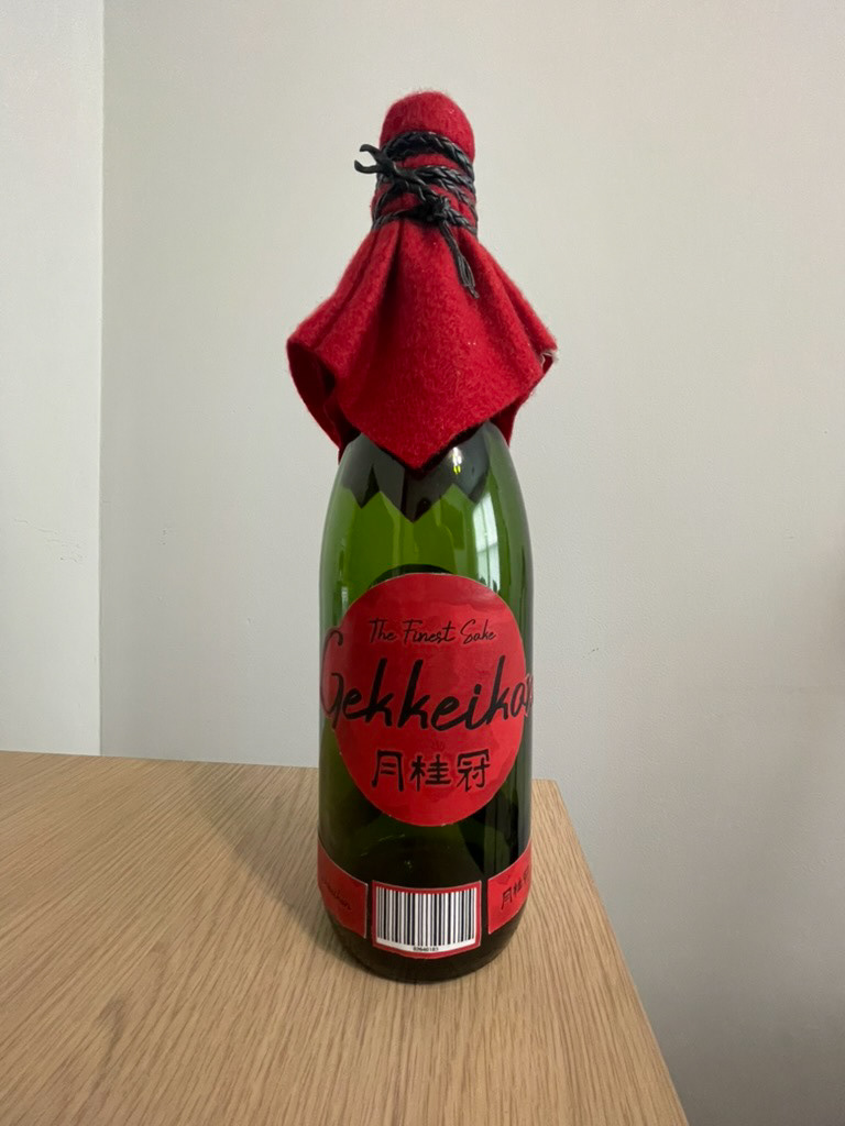


For this project I redesigned the label for Gekkeikan, one of the oldest sake breweries in the world. The goal was to keep the tradition of the brand while updating the look to feel more modern and appealing to today’s market. My design focuses on a bold red circle that represents the Japanese flag and highlights the cultural significance of red in Japan. I combined strong Japanese calligraphy with modern script typefaces and a subtle floral pattern in the background to balance tradition with a clean, contemporary look. I learned a lot about how design works with marketing, thinking not just about how the label looks but how colors, typography, and layout can catch someone’s eye and influence their decision to buy. The final result feels premium, culturally respectful, and visually striking on the bottle.